Do you ever feel like you’re ready for a change? That’s how I felt at the beginning of this year after looking at my brand and website. Something was definitely missing and I knew it was time to invest in a re-brand and new website.
After getting a recommendation from a fellow photographer, I reached out to Bonnie from B is for Bonnie Design to chat about potentially working together for this project. During the first ten minutes of talking with her, I knew immediately that I wanted to work with Bonnie! She truly understood my pain points and I really felt like she already knew my business and what I was trying to accomplish! And now that launch day is finally here, I can tell you that Bonnie was a complete joy to work with and I couldn’t recommend her more!!
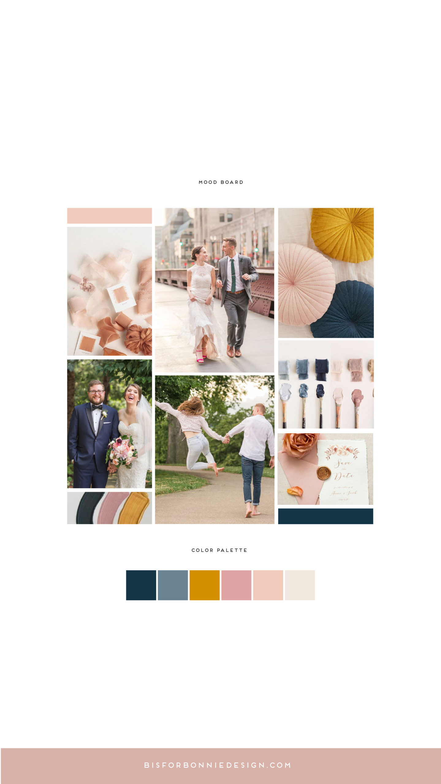
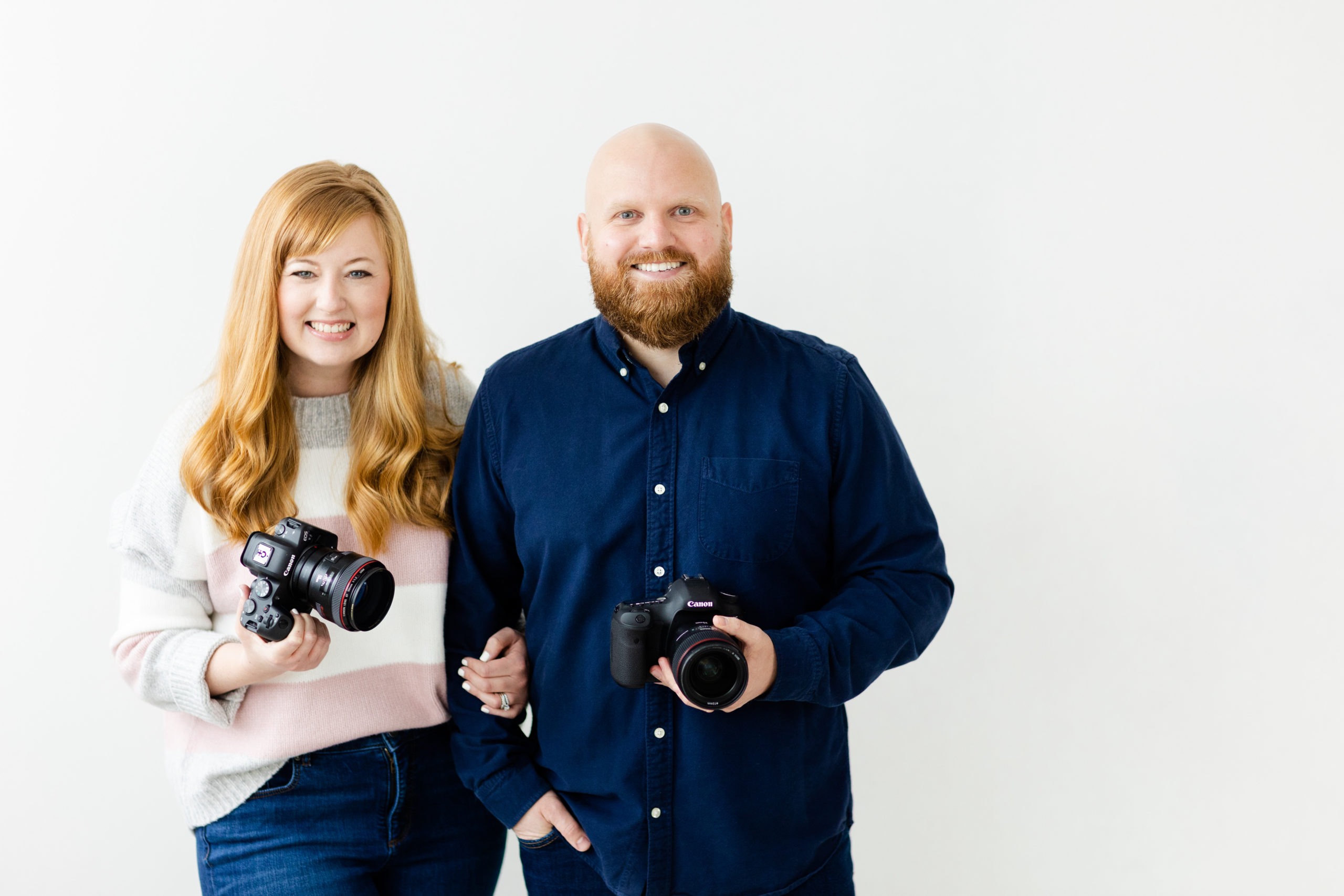
We started working on the branding elements back in February and for the first time I took a deep dive into the heart behind my business and how I wanted people to feel when they see my brand and land on my website. Bonnie asked the tough questions and Jason and I spent multiple hours defining our brand. After a couple of months, we had a beautiful new brand with a logo that I love and a color palette that make me so happy! From there, it was time to get started on the website!
Let me just say, I had no idea how much work a complete website overhaul was going to be. But now that it’s here, the hard work and late nights were more than worth it! I finally have a website that looks and feels exactly how I wanted and I couldn’t be happier! I would love for you to take a look around at our new little corner of the internet! You can either navigate to my website via the top of this blog or head to my homepage using this link!
p.s. If you leave a comment on this blog post, you’ll be entered into a giveaway for a donut gift card! Simply tell me your favorite part of the website and I’ll pick one lucky winner on July 7th. Your donut gift card will be emailed to you then! (You can choose from a Brewnuts gift card if you’re local to Cleveland or a Dunkin’ gift card if you live elsewhere!)


Congrats Allison & Jason!!! This site is gorgeous and I LOVE the new color pallet and logo!! Get out there and slay, girl!!
I cannot get over the colors! They are so happy and inviting!
My favorite part of the entire overhaul has to be the homepage. The flow is perfect – it shows everything AEP is about, and how much your previous clients LOVE you.
Congratulations on the new website AEP!
We love it!
Congratulations! The new website looks awesome and I love the featured photos! My favorite part is the font and logo! So classy and cute!! Can’t wait to work with you 🙂
I actually love it all! I feel like I’m talking to you when I look at it. I especially love the fun about you facts. Like you use 12 !!!!!!!!!!!! Per email! I am a total over-user of those too! The facts are neat because I don’t know Jason well and It gives me a chance to “see” him in the brand. Congratulations!!!!!
Jamie 💕
So proud of and happy for you and Jason! The new color scheme is such a perfect fit for you two – giving both a feminine and masculine feel while sending a calming vibe!